
Introduction
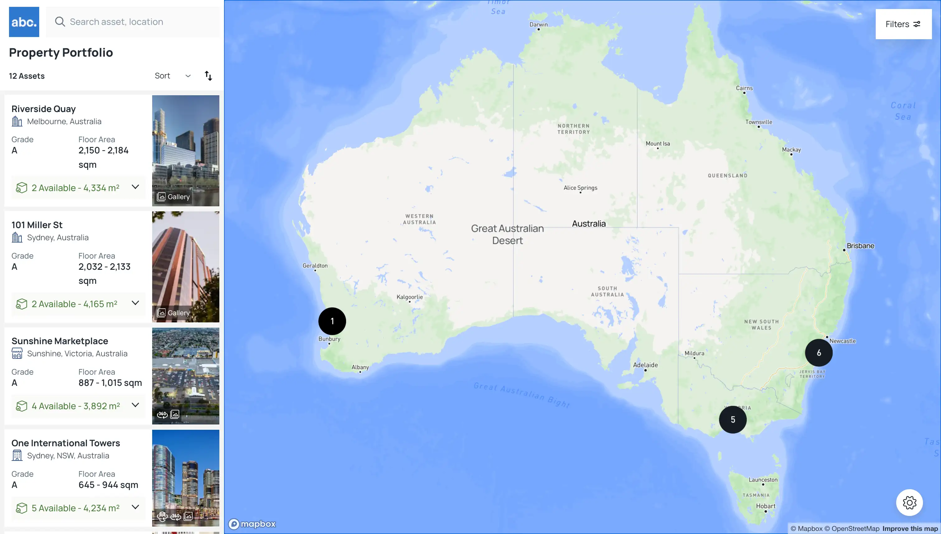
In collaboration with my colleague, Ben Zotti, who led the initial development, I had the opportunity to contribute significantly to the evolution of an innovative web-based interactive mapping platform. Originally designed to enhance the presentation of commercial real estate portfolios, ETFs, and REITs, our combined efforts have transformed it into a versatile tool that caters to a wide array of users, from real estate professionals to landlords and agents. My involvement became particularly instrumental during the platform's recent rewrite, which introduced a robust abstraction layer to its architecture, elevating the user experience and system flexibility.
This phase of the project was about enhancing and expanding the platform's capabilities, focusing on the middle layer UI where I played a key role in refining the JSON schema that underpins our user interface. The introduction of this schema-driven approach not only streamlined the customization process but also made the platform more adaptable, allowing users to interact with their data in more meaningful ways. By working closely with Ben and leveraging our shared vision, we've been able to push the boundaries of what interactive mapping platforms can achieve, making complex data more accessible and actionable for our users.
What I Worked On
Schema Design
At the heart of our interactive mapping platform lies a meticulously crafted JSON schema, a blueprint that defines the structure and interactivity of our user interface. This schema is more than just a static configuration; it is contextually aware, adapting the UI to reflect the different types of information users might need based on their current interaction mode.
One of the schema's core concepts is the contextual property. This property serves as a decision-maker that tailors the user experience according to specific contexts. For example, when the URL parameter ?mode=insights is detected, the schema consults the contextual property to determine which UI elements to display. This enables a dynamic shift in the layout and information presented, creating a custom-tailored experience without the need for separate pages or manual intervention.
Under the contextual branch, we delve into insights, a mode-driven feature that rearranges the platform's interface to highlight different data points and visualization cards pertinent to the user's current focus. Whether it's an in-depth look at a single asset, a comparative view in a multi-asset scenario, or a detailed examination of a specific space, the schema intelligently adjusts the UI elements.
For instance, the asset, multi, and space keys within the contextual object point to different data types and card layouts designed to emphasize particular aspects of the assets or spaces in question. This allows for a seamless transition between viewing modes, such as switching from a macro-level overview to a granular analysis of individual properties, all governed by the schema's versatile structure.
{
  "contextual": {
    "insights": {
      "asset": {
        "accordions": [
          "building_details",
          "building_overview",
          "building_availability"
        ],
      },
      "multi": {
        "accordions": [
          "precinct_overview",
          "precinct_buildings"
        ]
      },
      "space": {
        "accordions": [
          "listing_overview",
          "listing_details"
        ],
      }
    }
  }
}
This schema-centric approach not only streamlines the UI customization process but also significantly enhances the platform's adaptability, ensuring that users always have the most relevant and insightful data at their fingertips.
The above is just a small sample of what's under the hood, those accordions strings, point to another data structure that contains a name, and items. Items is a simple array of strings, mapping to cards. Cards are a bit like UI modules or building blocks, they are the smallest unit of UI that can be rendered.

{
  "ui": {
    "accordions": [
      {
        "id": "building_details",
        "title": "Property Details",
        "items": ["building_details_grid"]
      },
      {
        "id": "building_overview",
        "title": "Overview",
        "items": [
          "building_overview_highlights",
          "building_overview_description"
        ]
      }
      ...
    ],
    "cards": [
      ...
    ]
  },
}
The cards array is a collection of UI components that can be rendered. Each card has a type and items array. The type is a string that maps to a UI component, and the items array is a collection of data pointers that are passed to the UI component.
{
  "id": "building_details_grid",
  "data": {
    "type": "grid",
    "items": [
      ...
    ]
  }
}
UI Component Abstraction
The abstraction layer I introduced to the platform's UI components has been instrumental in enhancing the user experience and system flexibility. By creating a context-aware UI component that can adapt to different data types and interaction modes. This base abstraction layer has allowed us to build a more modular and scalable UI.
Below is a simplified example of how the abstraction layer works. The SwitchRenderer component takes a value prop and renders the appropriate UI component based on the value. This allows us to create a single component that can render different UI components based on the data it receives.
const ContextualCard = ({ card }) => {
  return (
    <SwitchRenderer value={card.type}>
      <Case value={CardTypes.Grid}>
         <Grid items={card.items}/>
      </Case>
      <Case value={CardTypes.List}>
          <List items={card.items}/>
      </Case>
      ...
    </SwitchRenderer>
  );
}
API / Database Design
The API was built on Azure Functions and the database was built on Postgres SQL, with the schema defined by typeORM. The database design had to be built around abstractions due to the dynamic nature of the platform. This added complexity to the database design, but was essential for the flexibility of the platform.
The initial API was built for a quick to market, easy to use approach, but as the platform grew, we needed to refactor the API to be more modular and scalable. This allowed us to build a flexible and intuitive API that can be easily extended and adapted to meet the needs of our users.
The refactoed API, however, was designed to allow for micro requests and complex select and filter queries, enabling users to interact with their data in more meaningful ways. This required a careful balance between performance and flexibility, but the end result was a powerful and intuitive API.
Skills Used
📐 Schema Design
Developed a dynamic JSON schema, enabling context-aware UI adaptations for diverse user interaction modes.
🎨 UI/UX Development
Focused on the middle layer UI, refining UI components and introducing an abstraction layer to enhance flexibility and user experience.
🗄️ API & Database Design
Architected a scalable API using Azure Functions and designed a dynamic database with Postgres SQL to accommodate complex queries.
🔩 Component Abstraction
Implemented a base abstraction layer for UI components, allowing for modular and scalable UI construction.
👥 Collaborative Development
Worked closely with colleagues, such as Ben Zotti, to collectively push the boundaries of interactive mapping platforms.
🚀 Performance Optimization
Balanced performance and flexibility in API design to create an intuitive and powerful platform backend.